Xero global notifications
2023, SaaS, Australia

DELIVERABLES
Product strategy
Design research
User experience
Concept development
ROLE
UX lead
Giving small business customers time back and peace of mind—leading to a 24% increase in engagement in the first iteration
As the Global Web Experience team, our mission is to improve the value of notifications, empowering small businesses to stay on top of their tasks. In 2021, we identified a low engagement rate, with the 90th percentile of users receiving around 15 notifications per month. On average, only 8% of these notifications were read within a week.
The current state of Xero notifications (Left: prompt; Right: notification feed)
Goals
To improve notifications with the following goals in mind:
Follow up on tasks faster – A well-designed notification conveys a sense of urgency, helping users determine whether immediate attention or action is required.
Track key JTBD more effortlessly – A more intuitive notification allows users to stay on top of their tasks with ease.
Dependency
Teams will need to migrate their content to the new panel.
Collaborate with teams to notify key JTBD by syncing the API between global notifications and domain teams.
Research to understand WHY
To begin understanding ‘WHY’ — only 8% of these notifications were read within a week.
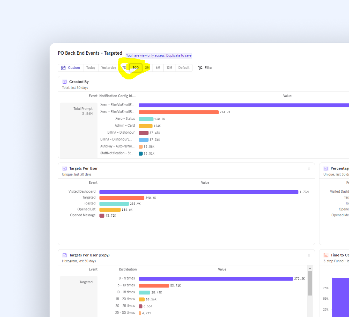
I analysed existing data using qualitative and quantitative research methods, including diary studies, interviews, a design research audit, and Mixpanel analytics, which provided early insights into the mental model and user needs.
The problems with ‘Xero to user’ comms
We identified five key How Might We (HMW) statements, including but not limited to:
HMW get customers to associate PostOffice with notifications they value, so they pay attention to PostOffice?
HMW ensure notifications that are sent to customers fulfil a customer need, so they get value from the notifications?
HMW make it quicker for customers to manage their notifications, so they can be more efficient with their time?
HMW only interrupt customers for important and urgent notifications, so that they’re only interrupted when they think the information is worth their attention?
HMW suggest to-dos for customers, so they can more easily keep track of the important and urgent tasks they need to do?
Prioritise opportunities and solutions
To ensure the design solutions were focused on the customers' underlying needs, we translated the findings into job stories. These agreed job stories helped the designer stay focussed on the needs as we moved into the solution phase. We conducted a rapid ideation workshop with cross-functional teams to generate a range of potential solutions based on these job stories. With the product team, we mapped these solutions into an Opportunity Solution Tree framework.

Build our confidence
Among the five key HWM statements, we started learning through bite-sized concept testing and A/B experiments, which allowed us to build confidence and get the details just right, as below are two main focuses:
Prompt (pop-up toast)
Notification feed
Focus 1Minimise disruptions
Removing the prompt (pop-up) from the bottom left corner will reduce interruptions without affecting the engagement rate.
Begin with small steps
In the short term, we can’t remove the prompt (pop-up toast). Our assumption is that it helps customers quickly and easily comprehend the information presented in the prompt and decide what requires their attention or action by using UserTesting.com.
The results showed that Option A was slightly more preferred with a total score of 51%.
“I prefer the bold message to tell me exactly what’s wrong and not have to read the small font underneath” - Small business owner
In-product experiment
Although previous concept testing provided valuable insights, it did not fully resolve the issue of high disruption. Research from the Card Sort Similarity Matrix - Notification UI and Interruption Level report revealed that 35% of users found the prompt highly interruptive, while 25% considered it somewhat disruptive. Also, many users ignored the prompt, finding the flow unintuitive for checking messages. To address this, I collaborated with a Data Analyst to implement small design changes in production and A/B test our early hypotheses.
What we want to validate
Removing the prompt for every message to reduce disruption and assess its impact on engagement rates.
As a result, we observed a slight increase in the engagement rate from 46.8 to 47.2%.
Focus 2Designing for efficiency, consistency, and scale
Over 56% of users preferred grouping notifications by JTBD (e.g., getting paid, bills to pay), helping them focus on relevant tasks.
Laying the foundation
To understand users' mental models of how notification messages are grouped to help them quickly and easily comprehend information in a feed and decide what requires their attention or action.
Option A: grouped by topics (e.g., bank feed, tax)
Option B: grouped type (e.g., action required, issue)
Option C: JTBD (e.g., getting paid, bills to pay)
The results showed that option C: JTBD was preferred, with a total score of 56.7%.
“it is grouped in a way that's more intuitive to the accounting activities affiliated to my business.” - Small business owner
Understanding the need for components
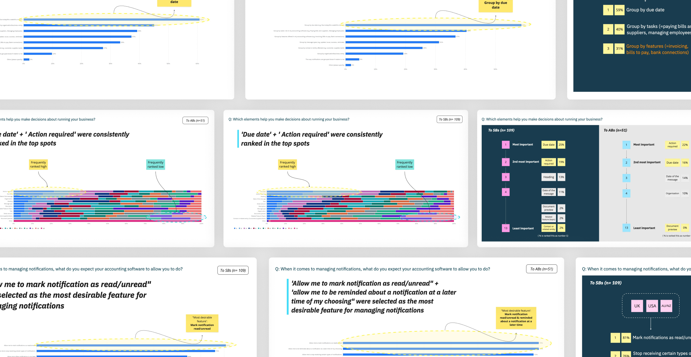
After understanding users' mental model for grouping messages, we conducted a survey to explore key elements (e.g., date, description, dollar amount, due date) and identify any missing information crucial for users in making decisions or supporting their business.
Key findings:
Over 70% of participants wanted the ability to mark notifications as read/unread and be reminded about a notification at a later time of choosing
Around 60% of participants chose 'Group by due date’ (e.g. Due today/this week/this month) as the most helpful way to see notifications in a feed
'Due date' + 'Action required' were most often ranked as the top 2 elements that help them make decisions about running their business
Understanding user needs via Qualtrics survey
Craft north-star vision
I also worked with the designers to come up with a longer-term design vision on how to extend our use cases beyond the homepage. We turned parts of our vision into objectives and assigned each other ownership. Having both the objectives from their teams and the design objectives have allowed the designers to have crystal clear personal goals throughout the year.
Collaboration beats constraints
Aside from product & user complexity, there is a series of constraints made of legacy, resource/tech limits, and historical debts. Workshops, team meetings, and syncs are essential to align priorities, build roadmaps and develop a product that hits the right spot timely.
I led a series of workshops to collaborate with domain teams’ designers as the below structure:

The outcome
Our vision in practice
We are already seeing the teams pick up on the principles/concepts to prioritise features and discuss when it comes OKR planning.
Teams across the organisation now have a shared language when designing, developing & releasing products.
We now have a common language to talk about what matters in our experiences, whether our experiences are explanatory.
Short-term improvement
Improved work efficiency via defined metrics on the redesigns, including:
The engagement rate increased from 23.8% to 48%
22% improvement in payroll page views


