Trally Byte-sized Teleportation
2021, Singapore

DELIVERABLES
Product strategy
Design research
User experience
Design system
UI design
ROLE
UX lead
Trally is a virtual travel agency that empowers travellers with virtual tours through a live-streaming, peer-to-peer marketplace
During Covid-19, 35M GLOBAL MILLENNIALS VACATION-DEPRIVED, everyone is stuck at home and eager to explore the world. The existing online travel contents lack authenticity, personalisation, and interaction. Trally provides a peer-to-peer platform that is affordable, easy to access, and creates local connections.
Achievements
6 months
built a MVP from 0 to 1 and successfully soft launched
30+ travel agencies
registered within a month
300+ Demo requests
within a month
Business goals
Expanding the business from China to Asian pacific
Running events and training programs, beginning with Maccu’s travel agents, university students and influencers, as well as such as discounts and referral codes to connect with local businesses.
100,000 users download the mobile app and 1,000 hosts create trips within three month
How we get here
As a startup, we move fast and boost an MVP as soon as possible, we are not only to align with our business goals, but we also follow human cognition and behaviours. I worked closely with the Product Manager to determine key features and plan a roadmap for creating an intuitive application in order to bring a positive impact on our product and a better outcome for the business.
Design principles
Decision making process helped us to form design decisions and to work with different delivery teams to create a more consistent experience in the fast-paced environment

Feature 1How might we help guests explore trips and search for more interesting options?
Hierarchy
Following the design principles, I create a simple and beautiful UI and design an experience that leads users to explore and browse trips intuitively. I demonstrate how we design the process to help users take actions as below flow.
Explore to Excite: Getting interest signals for users, engaging users to explore the page by showing various content.
Select trip to Checkout: Provide information in detail as much as possible to let users compare options to make the best choice. The most important is to encourage users to take actions either like/share or check out.
Explore page IA proposal
Trip page IA proposal
I have experimented with various listing cards that should align with users’ behaviours and information architecture. When I design the listing card, I keep asking myself: what do users want to see in the first place? What are the most factors for users to make a decision? Does it enough information for users? Is it easy to navigate? At the same time, I ensure the accessibility and delightful display for the exploring experience.
Smaller listing card: only showing the most critical information for the item - what is it, how much is it, where is the location? and other factors (ranking, duration, language)
Explore page design that provides users better accessibility and is easy to compare with other options within the small mobile device
The trip page contains massive information, and it is hard for users to digest it. Therefore, I tried to divide the chuck content into different sections, but I still revise the page a few times and conduct an A/B test to gather users’ feedback.
Following the below design principles to re-layout and ensure it is easy to read.
Principle of intimacy
Alignment principle
Repetition principle
Contrast principle
AB testing results
67% of users chose version “After” as the user of portrait images and clear sections with icons, making it easier for them to read the information in detail.
Feature 2How might we help hosts to create a trip more intuitively and efficiently?
Create a trip
Creating a trip is the most important feature for a host; our challenge is to help them create a trip in a few mins?
We have come up with two potential solutions, but we still have a concern about them. So I decided to conduct an A/B test and get feedback from users.
One page form field: This design aims to minimise the click rate, but the downside is users feel overwhelmed and crowded to fill in each field.
Step-by-step form field: the concept is to guide users to fill in the form step by step and only focus on one task at a time. However, some team members feel this process is a bit long, and they want to quit halfway.
AB testing results
Results indicated 71% of users preferred the “after” version of the create a trip as it provides a simple task step by step with easier to complete than the “before” version.
Feature 3How might we make the peer-to-peer live stream more accessible and interactive?
Live-streaming design
For guests
For hosts
Previous feedback indicated that users had a live-streaming experience on Instagram, and they prefer the seamless experience when they use a new platform.
I worked closely with developers to understand how a live-streaming works and any constraints. I then iterated on the designs with the valuable insights I gathered through Guerrilla Research while ensuring the designs always aligned with our user’s needs.
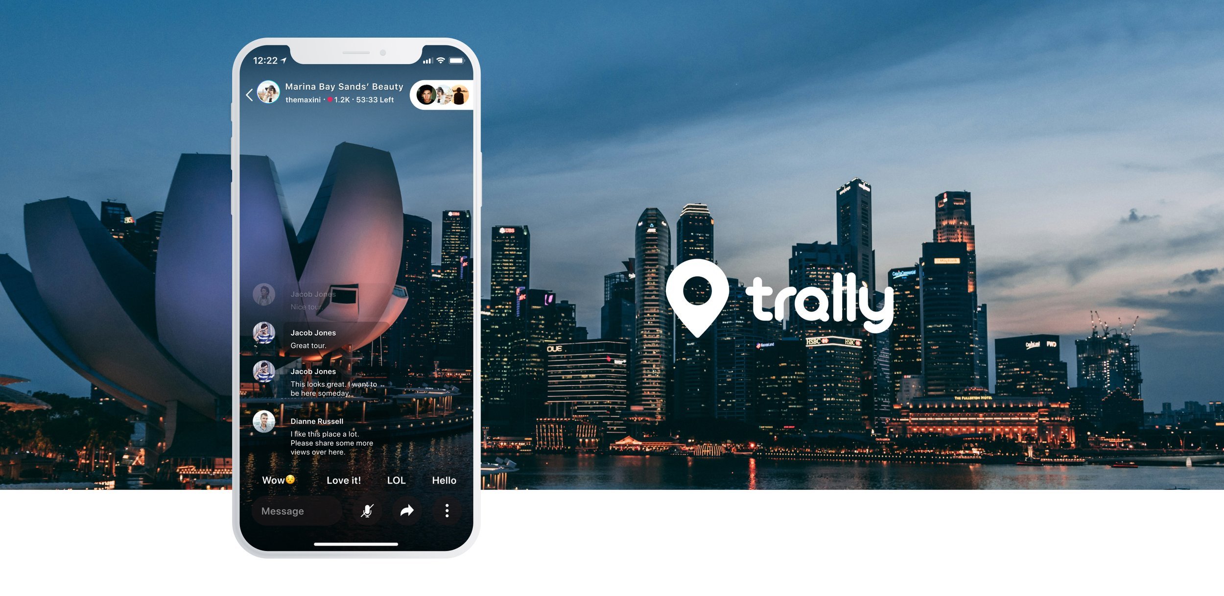
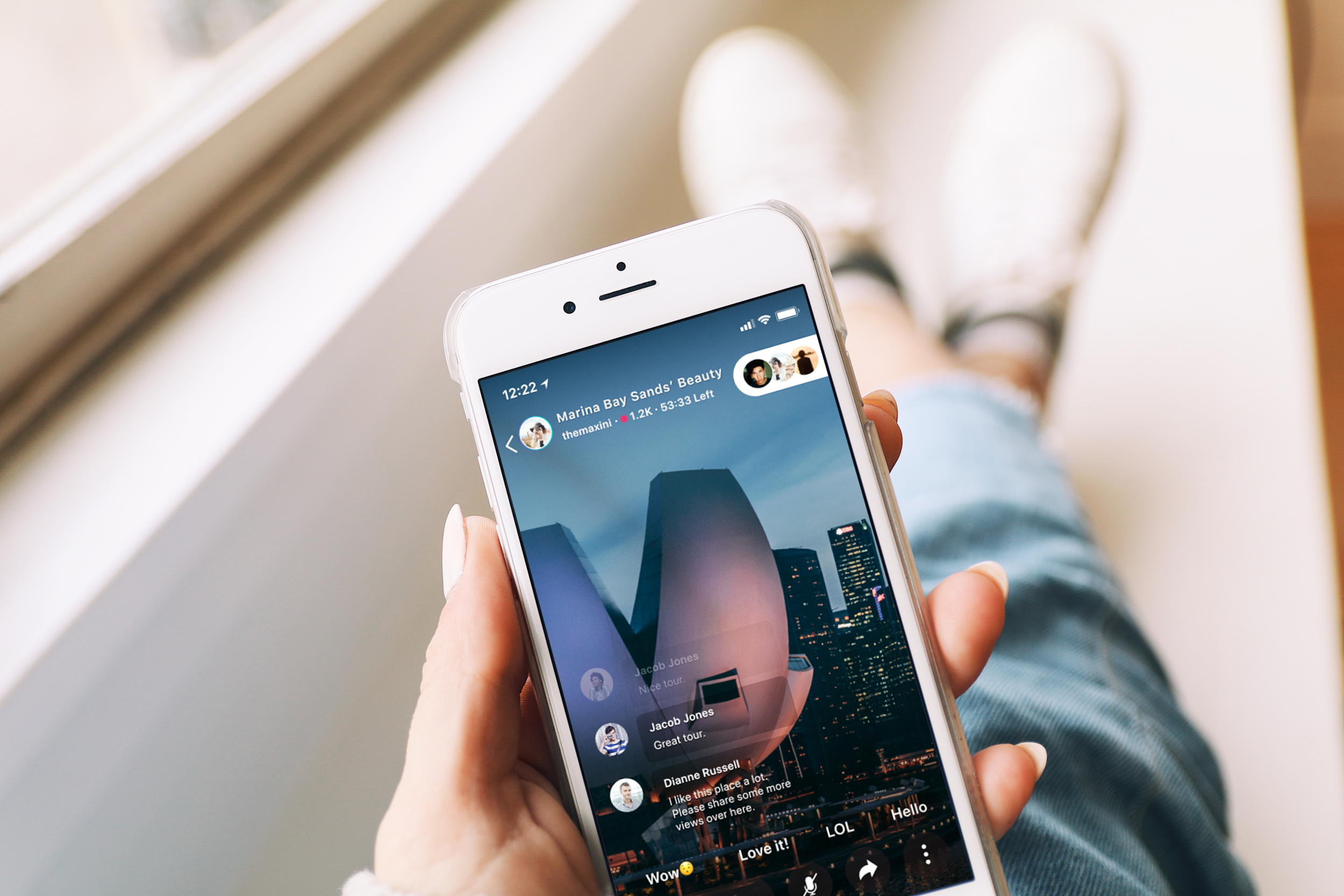
Clear and intuitive to join live-streaming to enjoy senses in order to interact with a host by clicking emoji, leaving comments and inviting friends/families
There are 3 simple clicks to start live streaming without any technical barrier and easy to engage with guests. Clear status label to show how many participants and how long the trip has left.

Takeaways &
Learnings
Download App
I had the privilege of working with this project from scratch to the app launch in September of 2021. I went through the different phases of development with complicated technical issues on the front end and few times constructive redesign to align with business goals; it was a delightful challenge. Additionally, remote working with varying time zones among teams was challenging, but I tried to build a systemic workflow that includes handover documents, components, and explicit instruction.
I have elevated my management skills and design strategy as well as bring users voices to drive the project direction. I was also in charge of the end-to-end UX process from researching, planning and delivering design work in order to meet business expectations and priorities.


